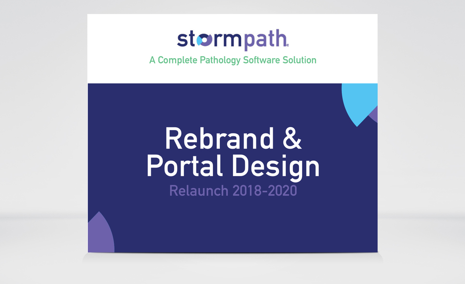
Stormpath Rebrand
On March 29, 2020 Stormpath was launched with a new logo, brand look and feel as well as a digital ad campaign. Stormpath is a comprehensive software solution for pathologists to use when reporting on esoteric testing.
This is a 60 page document that will provide you, with the overview of Stormpath's new brand and the create process.
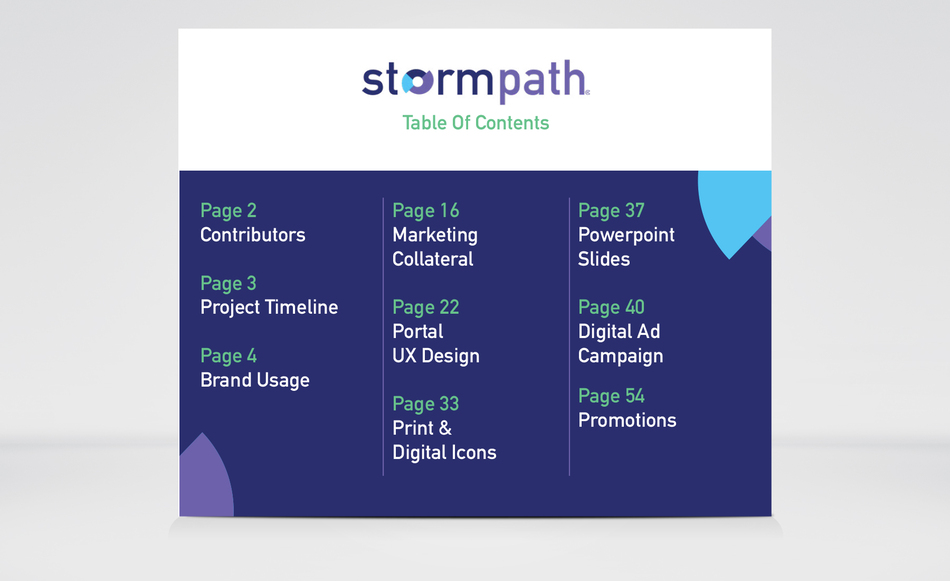
This is a 60 page document that will provide you, with the overview of Stormpath's new brand and the create process.
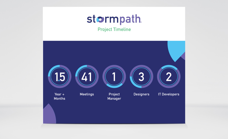
Stormpath's project Timeline in regards to how long the project took, meetings held, IT, designers and Project Manger.
This is Stormpath's introduction page, on how to utilize the new logo, look and feel, messaging and color palette of this brand.
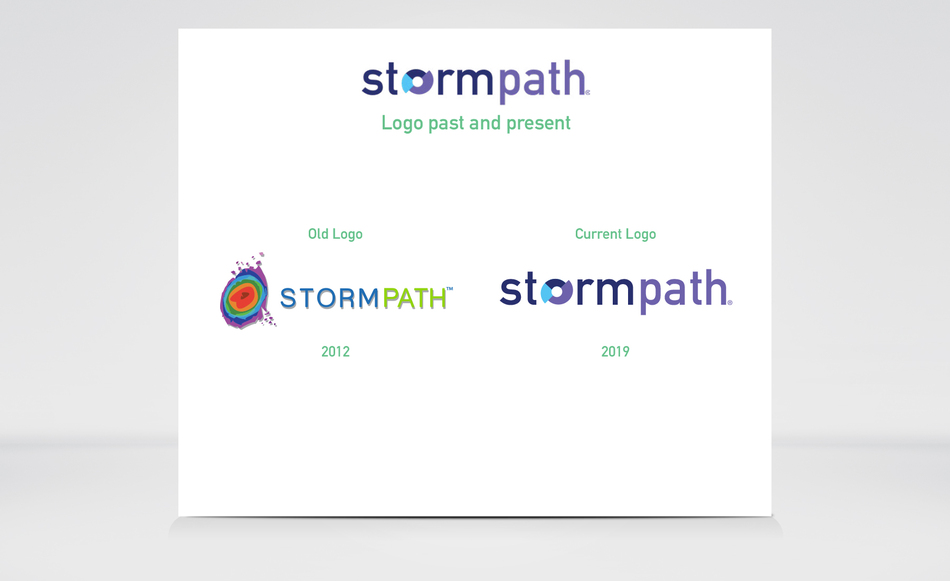
The logo on the left is the OLD stormpath logo and the NEW logo is located on the right.
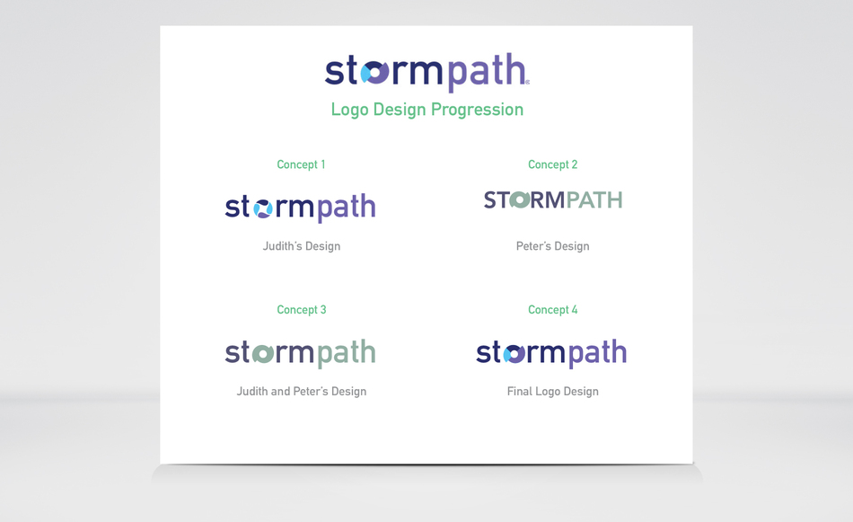
This is how the Stormpath's logo was created by myself and another designer.
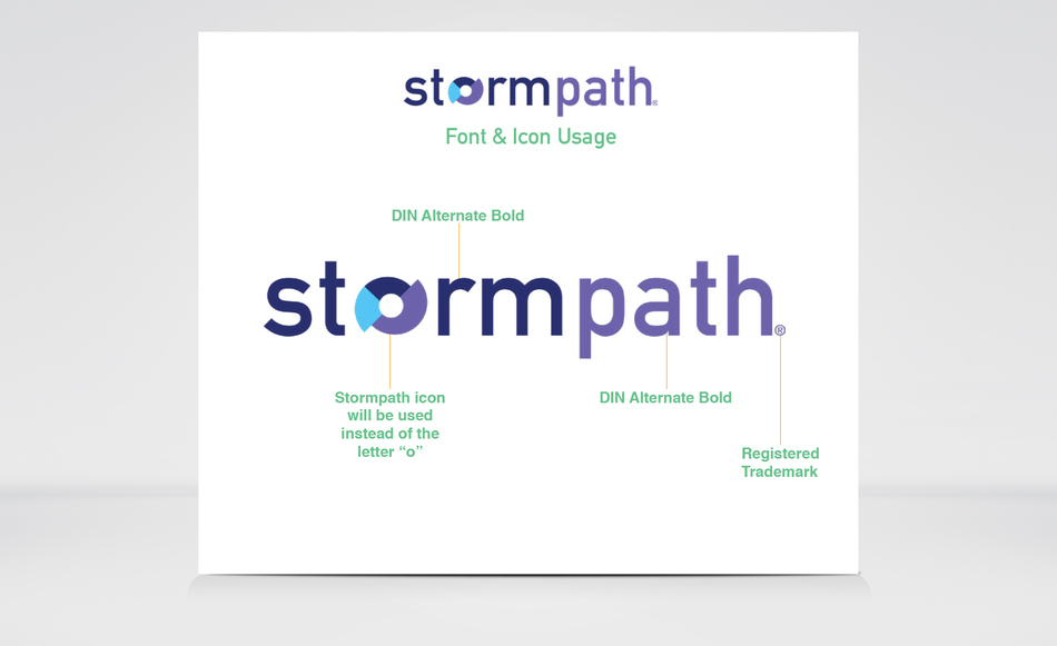
Since Stormpath is a technical software. I decided to go with a "tech" based font called Din Alternate Bold with the pinwheel icon as it's letter "o". Also, in order for this logo to be used properly, we had to include a "Registered Trademark". The Registered Trademark is located after the letter "h" on the bottom right hand side.
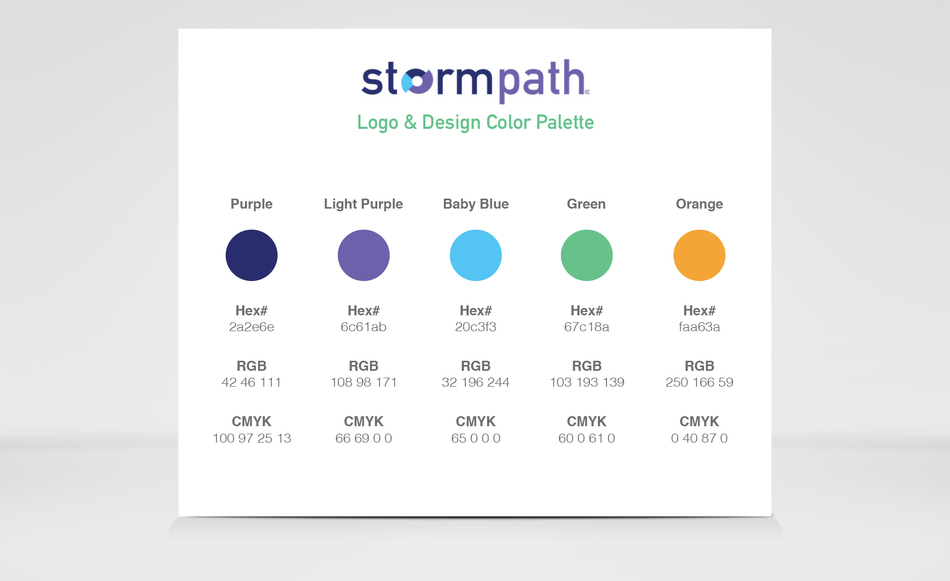
This is Stormpath's color palette, that was used throughout the design process, as well given to the social media and IT department to develop my designs and keep everything cohesive.
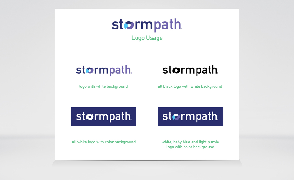
This is how Stormpath's logo, on various backgrounds should look.
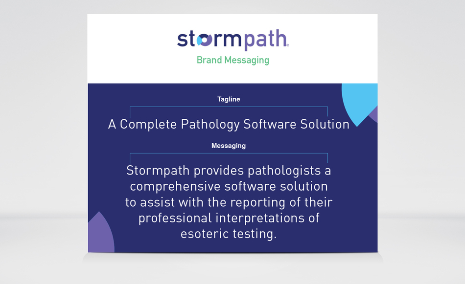
This is Stormpath's tagline and messaging for it's brand.
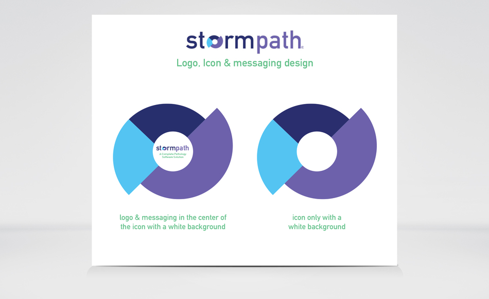
Stormpath's icon was created, so that it could be utilized as a fun and play icon on brochures and in videos. There are 2 design options and this design option 1.
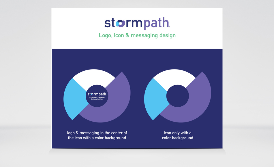
Stormpath's icon was created, so that it could be utilized as a fun and play icon on brochures and in videos. There are 2 design options and this design option 2.
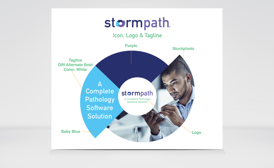
This is Stormpath's logo, icon and photo included all into one design element.
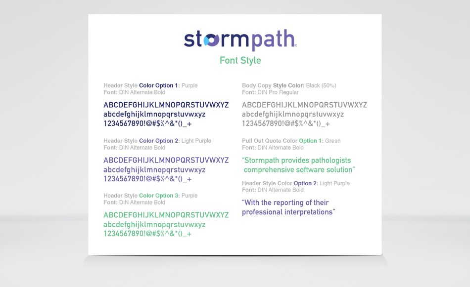
This is Stormpath's font style.
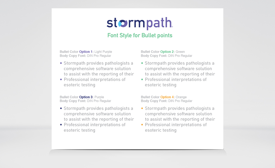
This is Stormpath's font style for Bullet points.
The port was redesigned by me, however you have to request a demo to see the interior. This product is one that you must subscribe to it in order to use it. HERE IS THE LINK ( https://genpathoncology.bioreference.com/stormpath )
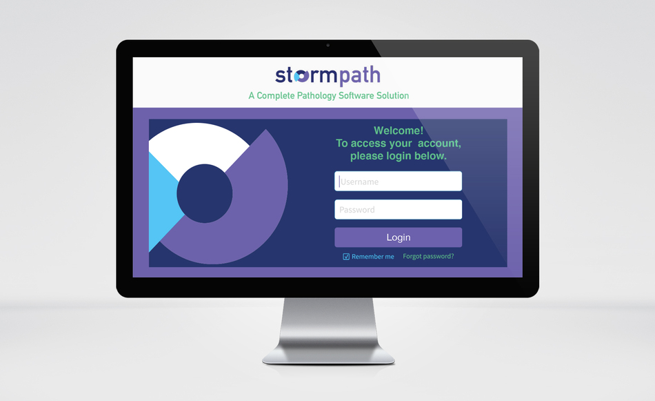
This is the new logo in page that was created for users.
In addition to a rebrand for Stormpath, in 2020. A video teaser was created by me, using After Effects and released to future clientele and trade show events for large screen monitors and television screens.
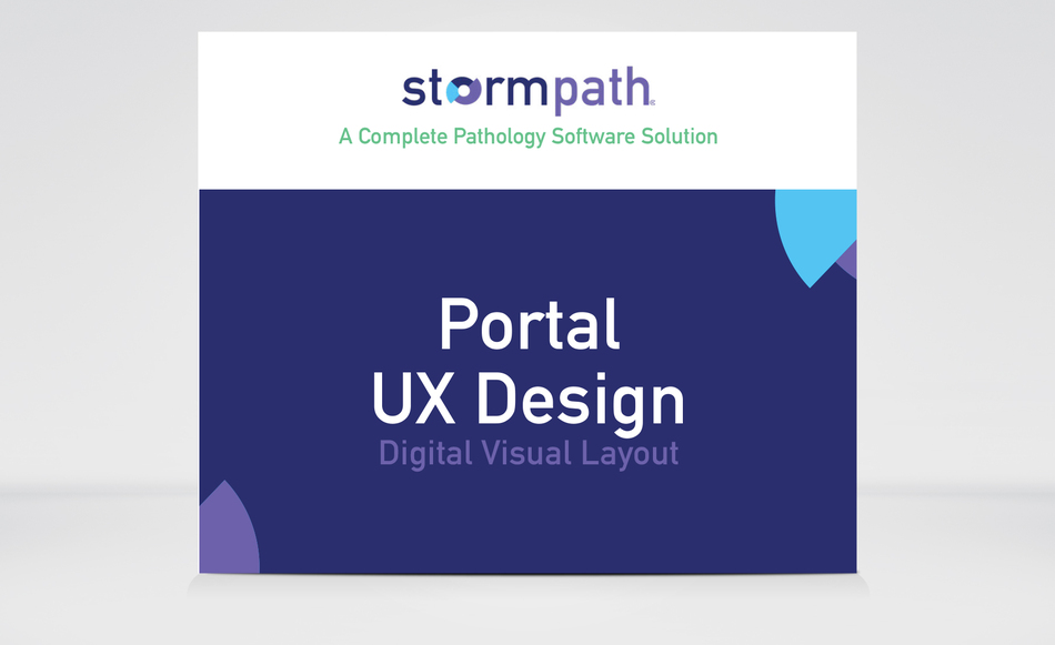
This section will showcase updated icons for the User Experience.
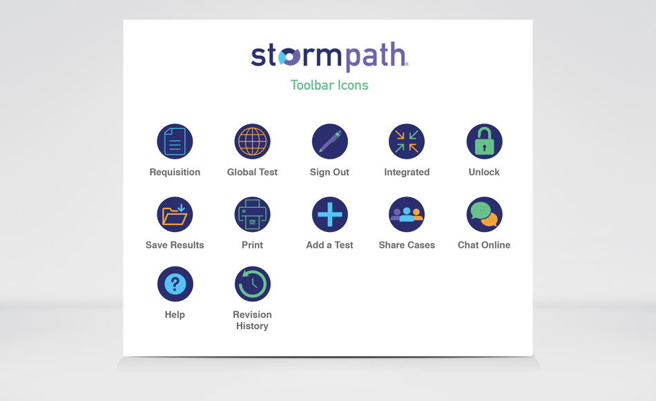
These new icons will be displayed in Stormpath's software located on the right hand side of the screen. This is page 1 of 2.
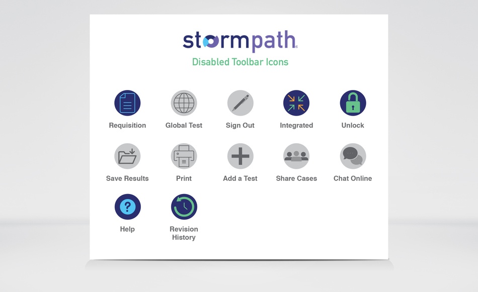
These new icons will be displayed in Stormpath's software located on the right hand side of the screen. This is page 2 of 2. When the user is on a certain page in the software, some icons will not be available to the user. Therefore, those icons will show up as grey and non-response when clicked on by a user.
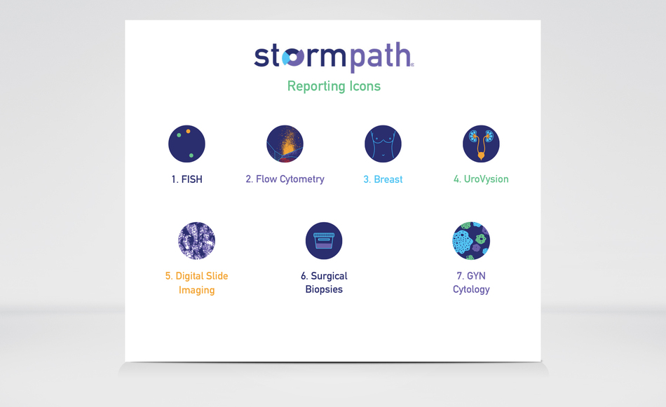
These new icons have been created for Stormpath's reporting results. The icons above have been used in a 3 minute video, informing a user what the program does, what offers it provides and etc. You can review the video through this link. Enjoy! ( https://vimeo.com/355992428/b2c51f95cf )
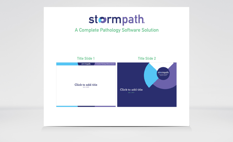
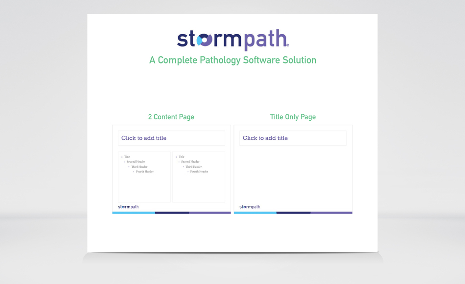
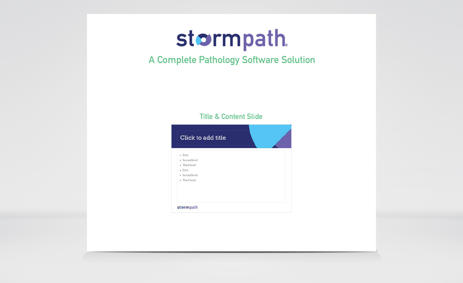
The following pages will showcase a power point slide deck. That the sales team used when presenting to current clients and future clients.
Rebranded Stormpath power point slide deck ( 2 of 7 slides ).
Rebranded Stormpath power point slide deck ( 2 of 7 slides ).
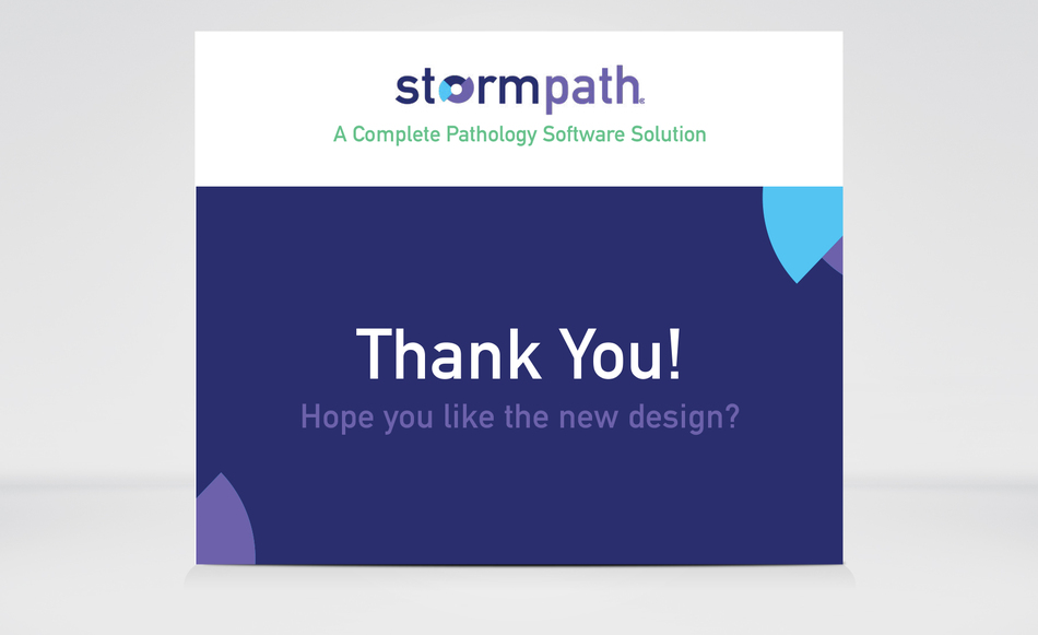
Rebranded Stormpath power point slide deck ( 1 of 7 slides ).
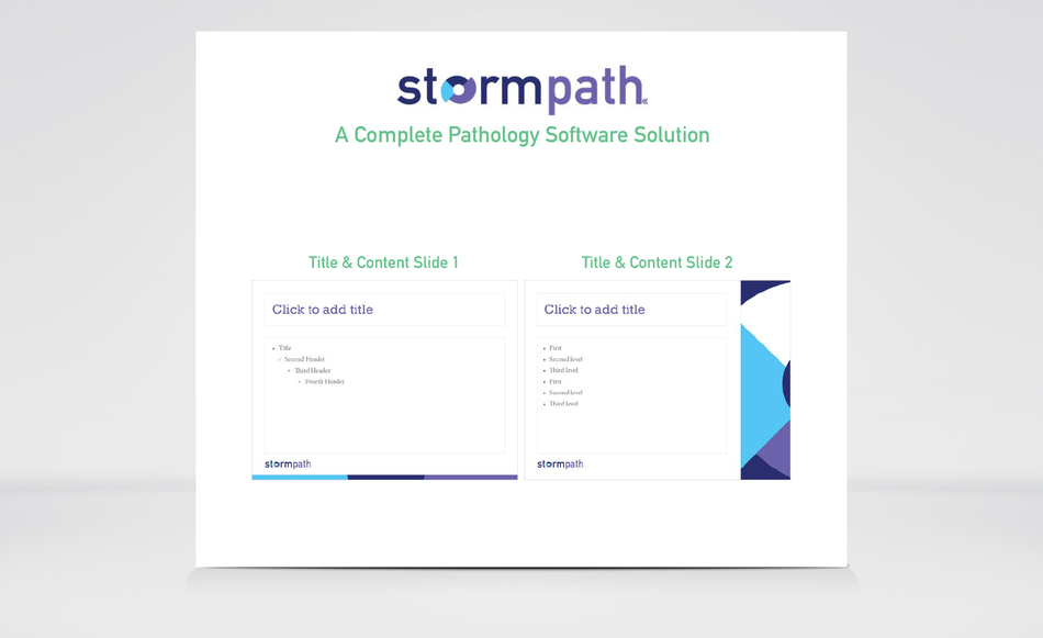
Rebranded Stormpath power point slide deck ( 2 of 7 slides ).
Stormpath's rebrand included a digital ad campaign online via LinkedIn, Twitter and Facebook.
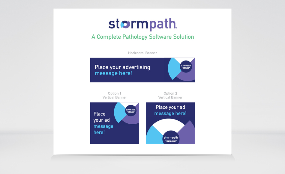
Stormpath's digital banner / concept look and feel.
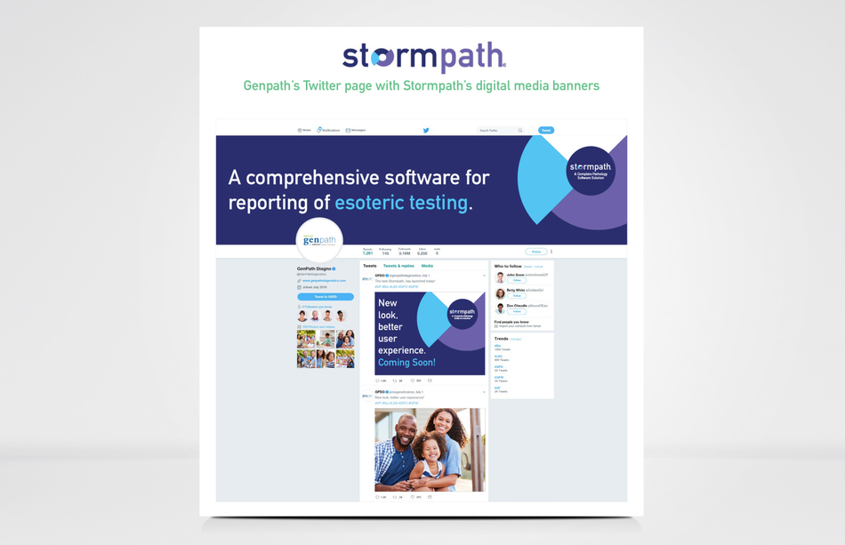
Stormpath's rebrand included a digital ad campaign online via LinkedIn, Twitter and Facebook which ran from March to April 2020.
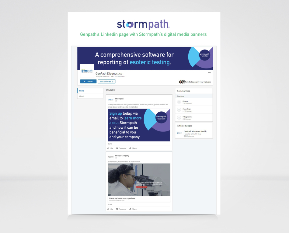
Stormpath's rebrand included a digital ad campaign online via LinkedIn, Twitter and Facebook which ran from March to April 2020.

Stormpath's rebrand also included promotional items, that will be distributed at medical conventions and client meetings.
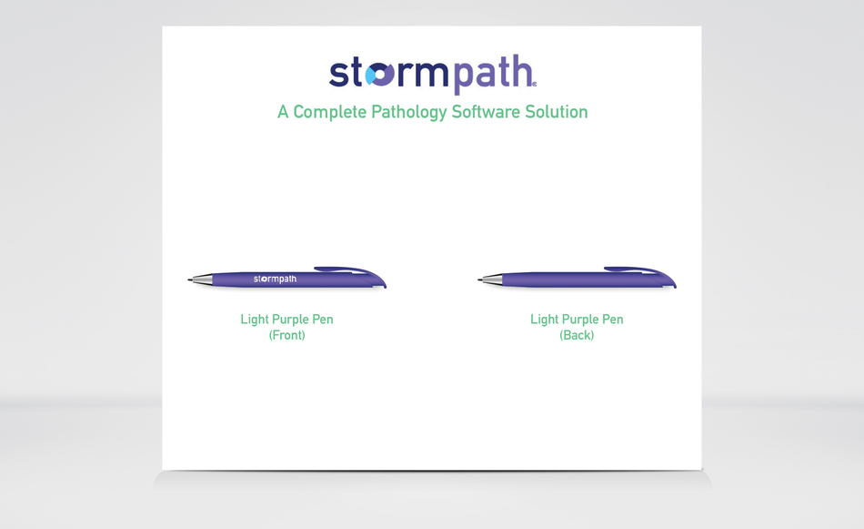
This is a soft touch purple pen with a all "sliver" Stormpath logo located on the side.
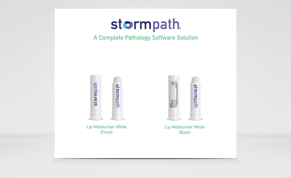
This is a cherry flavor lip balm with Stormpath's new brand located on the front.
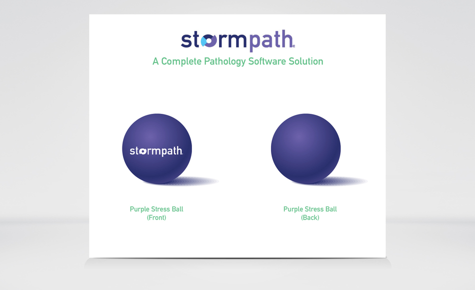
This is a all purple stress ball, with Stormpath's new logo all in white, located on the front.
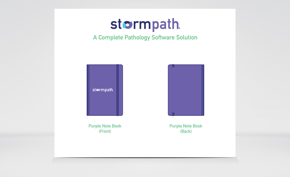
This is a all purple Stormpath notebook with a, all white logo on the front.