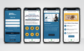
Logo Design Process
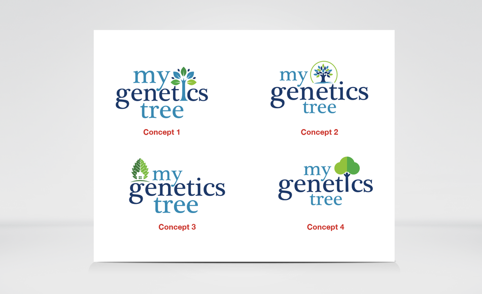
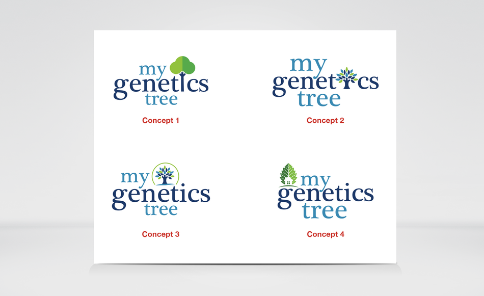
The 1st round of 4 design concepts for the project, My Genetics Tree is above and I used 4 colors from the 6 color palette.
Concept 1 was adjusted in regards to the tree’s root. One to look like the bottom of a tree and the other to look like a the letter “I” while including the tree leaves around it.
Concept 2, was provide with 2 options. One with the tree as the main icon and another with the “I” as a mini / small dark blue tree.
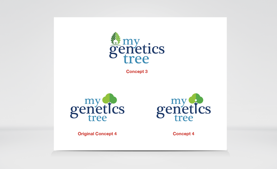
Concept 3, was left as is. Concept 4, included a “white dot” in the tree to make it clear that the tree is suppose to be a “I”.
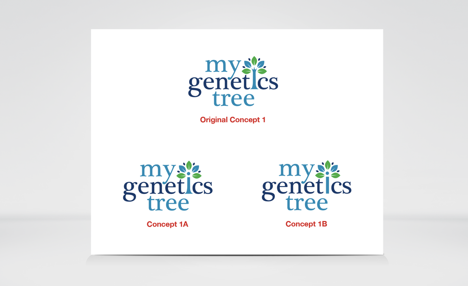
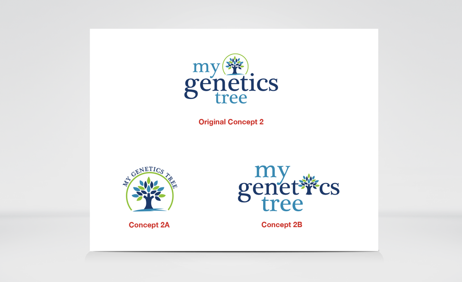
This is the 2nd round of the 4 design concepts after review and the adjusted concepts where selected.
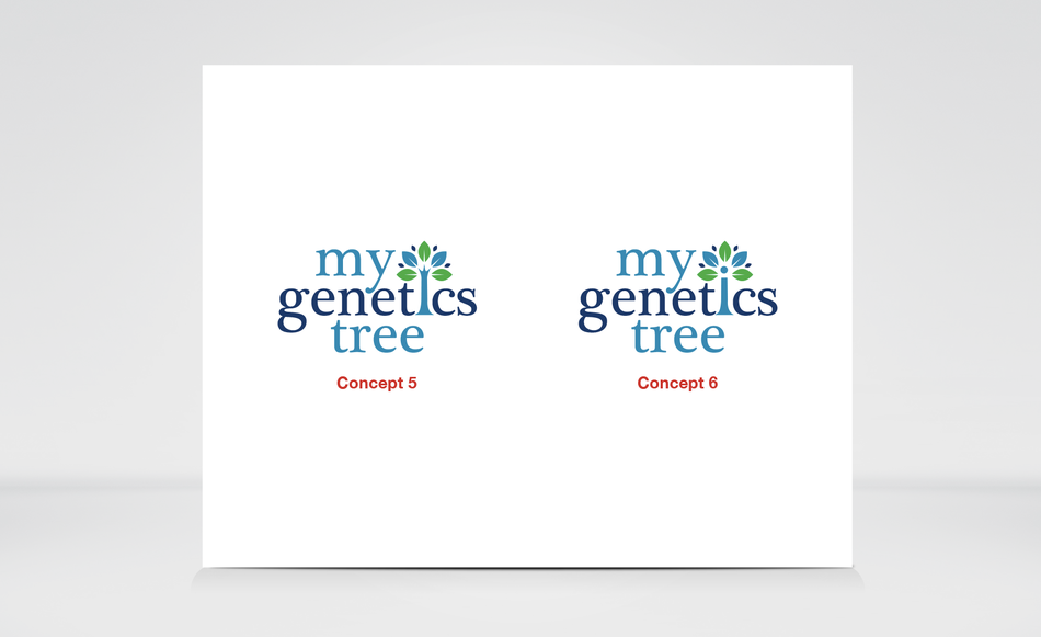
Concept 1 was adjusted for a 2nd time to make both tree’s look like the bottom of a tree root.
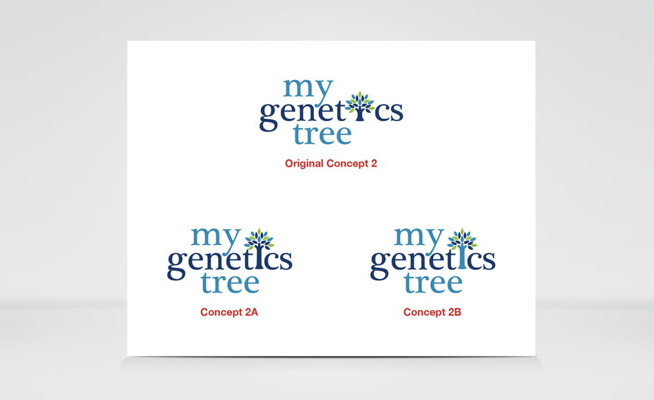
Concept 2, was adjusted from a small tree to a full length tree and I tried a dark blue and light blue color to see which option looks best.
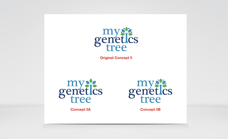
Concept 5, was adjusted to what the tree would look like, with out the small leaves and with the leaves, but more defined.
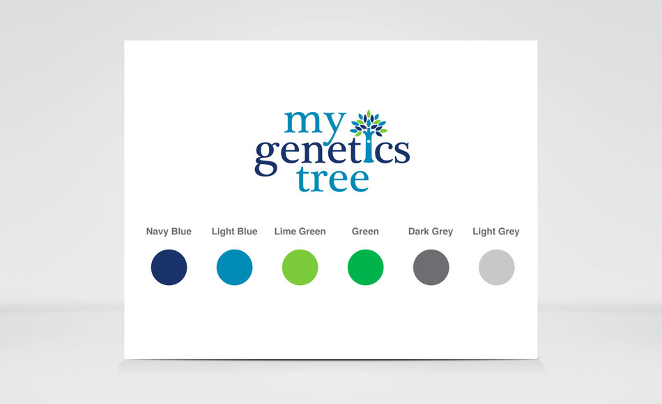
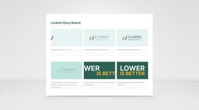
The final concept that was selected was Concept # 2, will a full tree and I also added in a white dot on the tree and used the 1st 4 colors from the color palette for this logo. The final logo was also created in all white and full black for print and digital projects.