UI/UX Conceptual Ideas
As a Senior Art Director I had the opportunity to come up with some creative options for Livdelzi's HCP website.
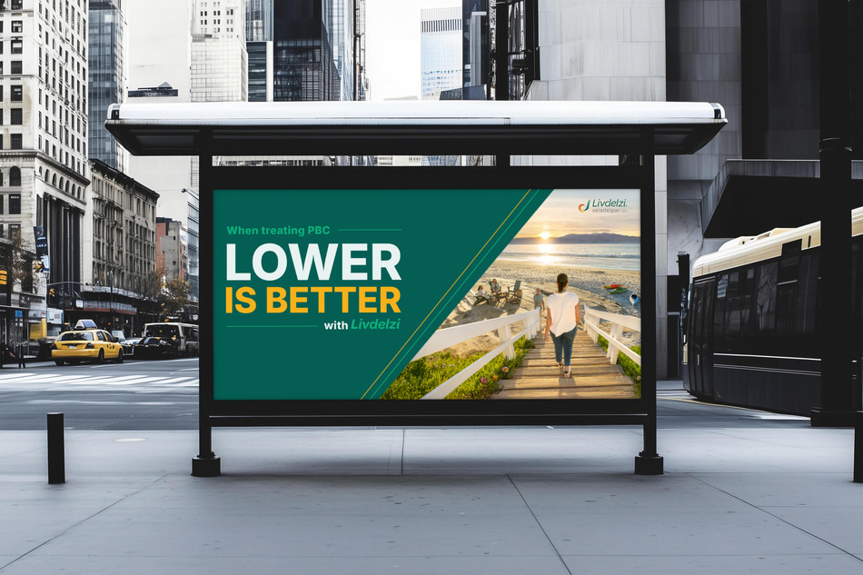
I came up with 3 design concepts for the Livdelzi brand, and above, is one of them in large print / advertisement form.
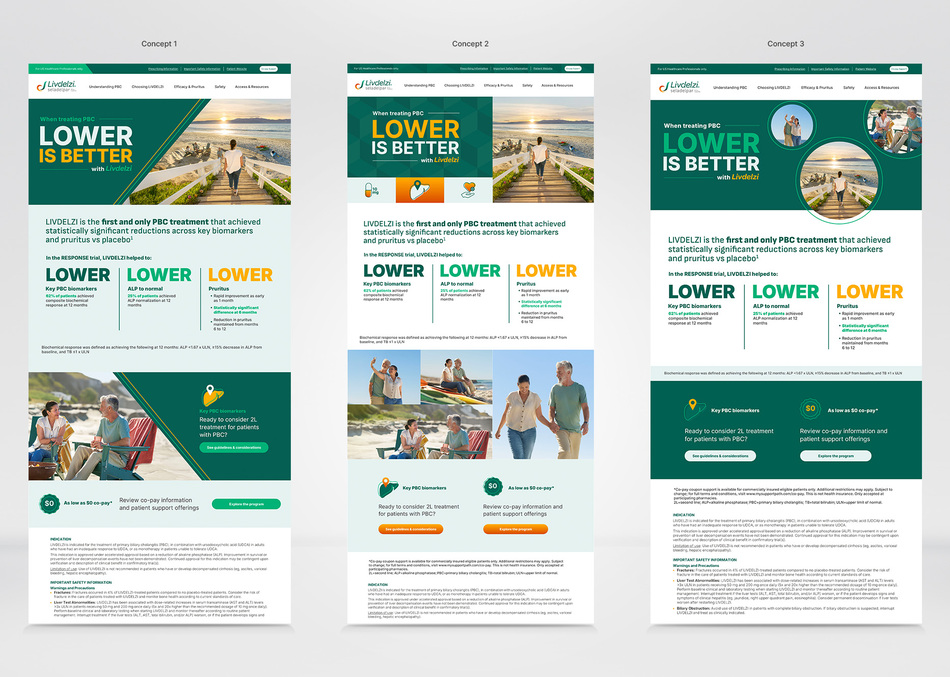
Above are 3 creative concepts for Livdelz's HCP website. I wanted to design something bold for each website, Concept 1's lines relate to the slogan Lower Lower Lower. Concept 2 has geometric steps, for the background with their logo lockup on top and the 3 icons would link to various pages on the website. Concept 3 would allow the opportunity for more images to be brought in and the lines would make the creative feel like they are moving and dynamic. Also, the word Lower are in 3 different colors, so that area would stand out.

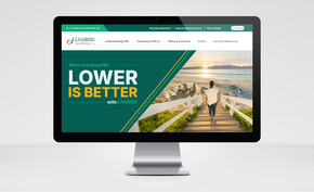
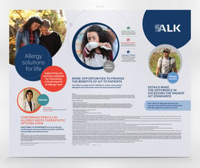
I designed 3 creative options for the brand, Livdelzi's HCP Website and above is one of the creative options homepage.
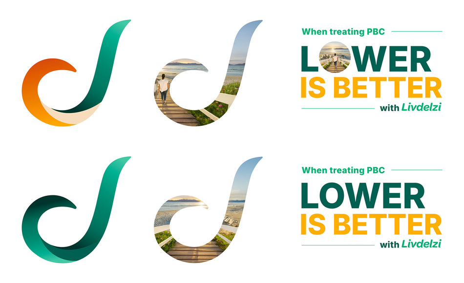
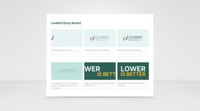
Livdelz's "L" in their brand is called the delta. I wanted to incorporate their brand image into the delta symbol and also see what their main image would look like in their logo lockup instead of the letter "o". I also applied their green to the delta symbol to see what that would look like as well.
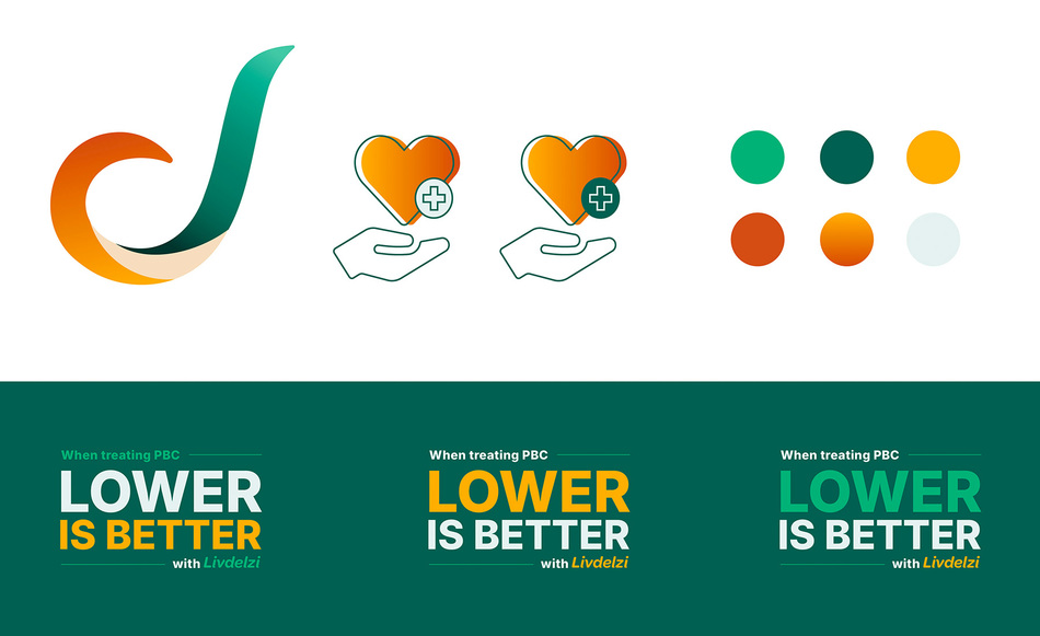
Above are logo options based off of their delta symbol and I l also, changed the colors for their original logo lockup to show various options. There color palette is located on the top right-hand side as well.