Rebranding Concept
The project below is a deck that I worked on with a copy writer, to display a "futuristic look" for RevHealth, since they are planning on rebranding in the Fall of 2023 / Spring of 2024. Concept 1 is a based off my experience at the Colorfactory and its fun interactive rooms and technology. Concept 2 is based off a solar system theme. Each concept comes with taglines and tactics on how one would approach the brands look and feel and how an observer, would interact with each concept.
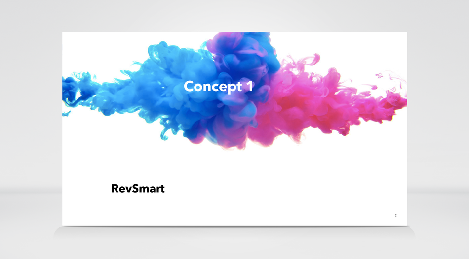
RevHealth Concept 1 slide, in Deck.
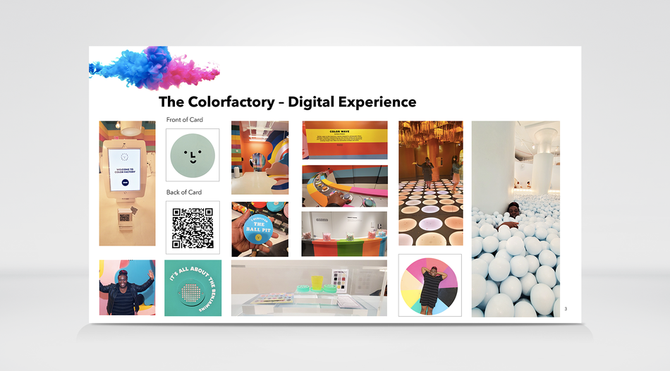
My Colorfactory experience in NYC, that sparked the idea for Concept 1 in my Pitch Deck.
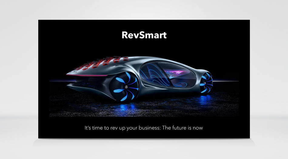
Revsmart and the tagline: "It’s time to rev up your business: The future is now"
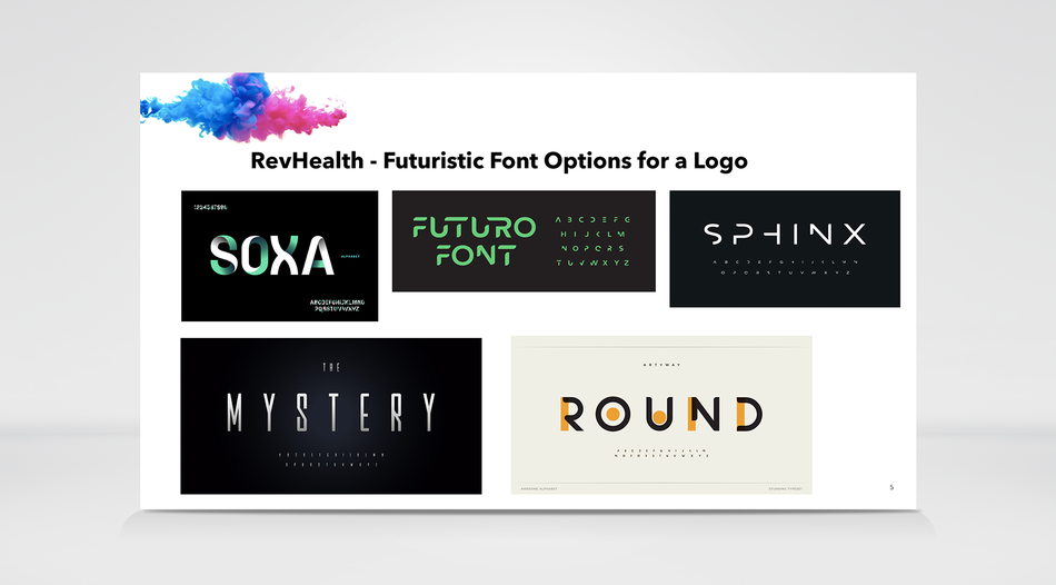
Futuristic looking font ideas for RevHealth's logo.
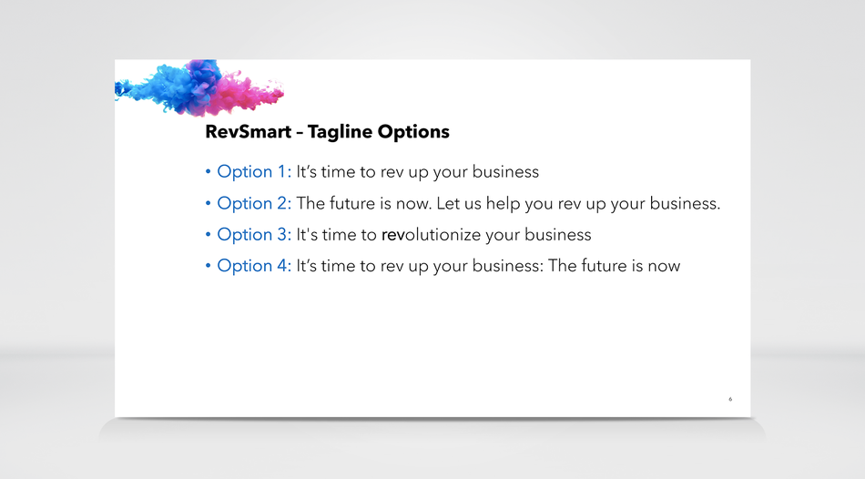
These are the 4 taglines that the copy writer i worked with came up with and we decided to go with Option #4.
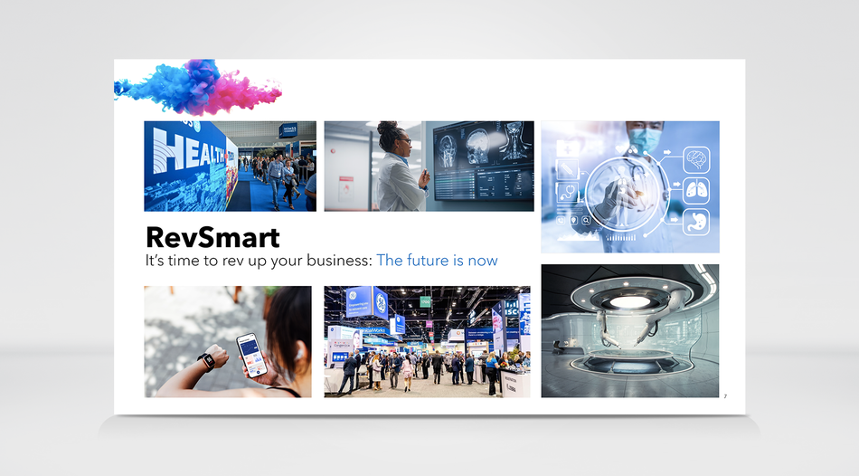
Revsmart, it's tagline and futuristic looking images of Helathcare.
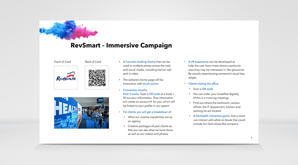
RevSmart's tactics

I would like for the home page to be interactive and have various touch points, when a user is on the website, like with on a car's website. If you touch the car door, it will open and you can look into it, do a 360 degree spin and so on. I would like to bring that idea to RevHealth's website, but in this case, it would apply to healthcare based images.
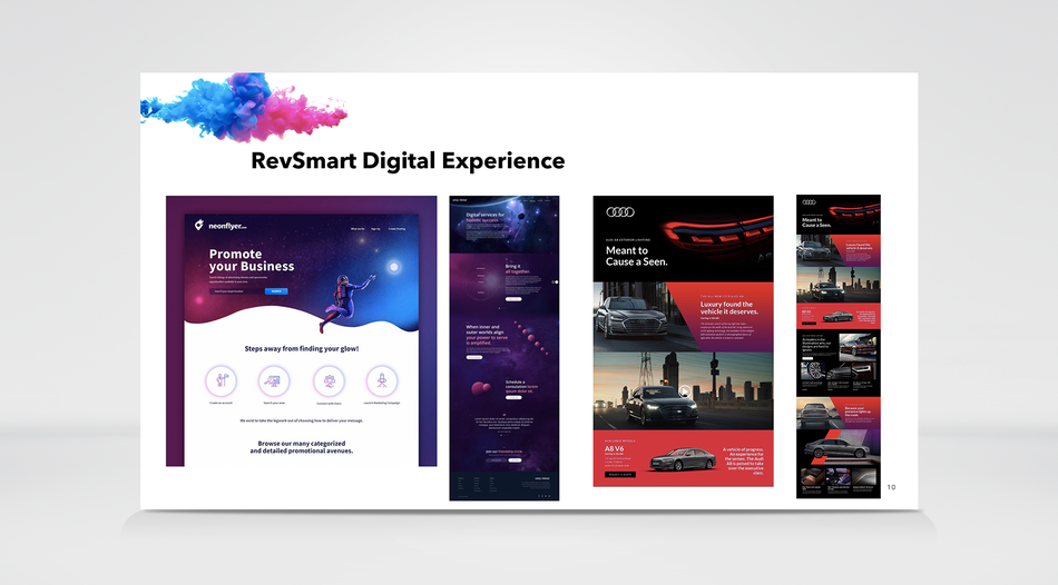
These are visual images of how I would like the website to look, taking a few design elements from a car website and applying them to a futuristic looking website, like in the first 2 images.
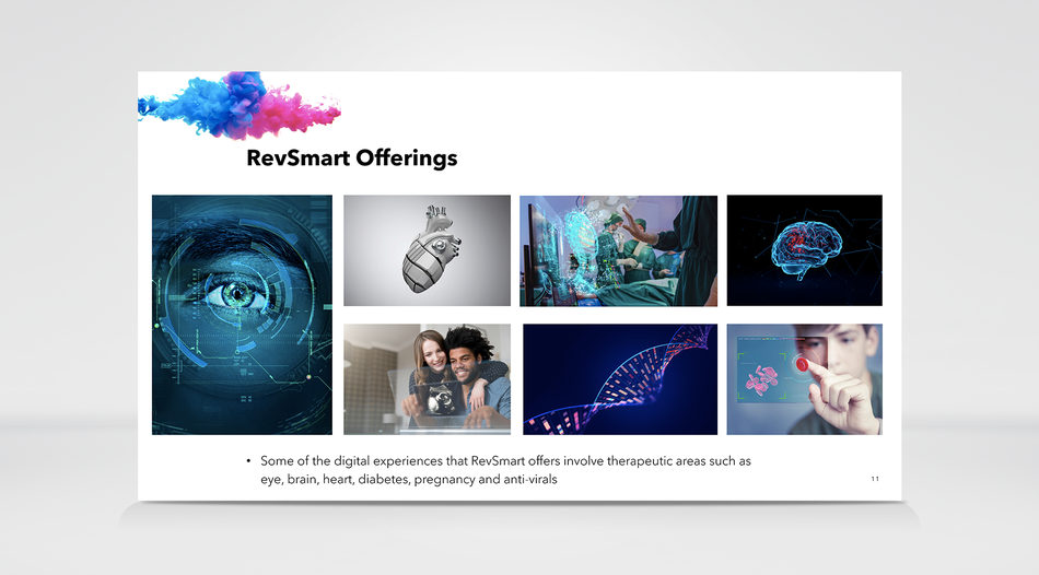
This page was just to highlight the offering's that RevHealth has, and would be displayed on their website.
RevHealth Concept 2 slide, in Deck.
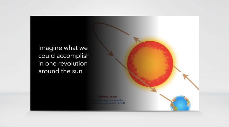
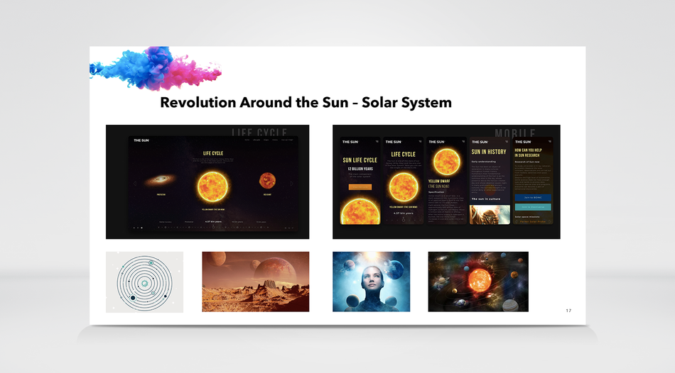
RevHealth Concept 2 was based around the sun.
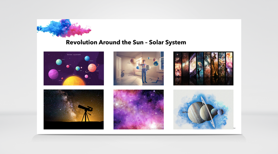
These are visual images of the Sun and solar system to provide an individual, with the look and feel of what we are trying to convey.
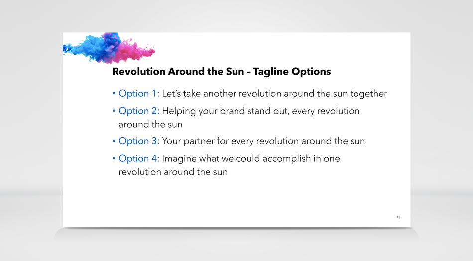
These are the 4 taglines that the copy writer i worked with came up with, and we decided to go with Option #4.
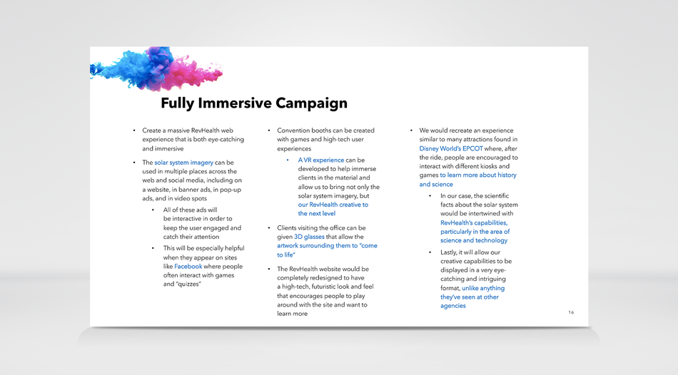
Solar System tactics
We liked the look of the sun design and images featured in the layout above, and created a mood board to show case our ideas.
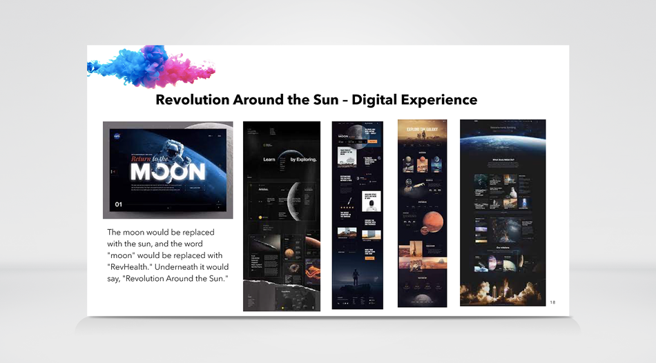
The look and feel of this website is nice, and instead of a space them, we would like to replace the space images with a sun and the solar system. Again this is a mood board.
Intro slide of ideas that didn't make the final cut.
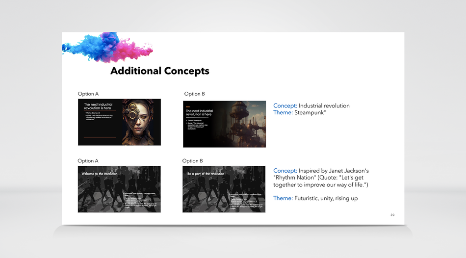
Our other 2 ideas were IDEA 1: Steampunk and IDEA 2: Futuristic, unity, rising up. Those were not selected but we what to show case all of the ideas we came up with and the ones, that we felt worked the best.